Color of the Year
 Since 2000, the Pantone Color Institute has gathered with secretive representatives of color standards groups to deliberate and select the next year’s “Color of the Year”. These clandestine meetings occur twice annually in various European capitals and the decision made there causes a ripple effect throughout the design, media, and other industries.
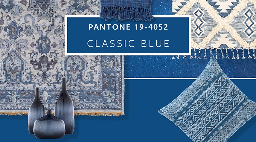
The 2020 Pantone Color of the Year is none other than Classic Blue. We are going to take a look at this deep, beautiful blue and discuss some of the design trends as a result of 2020’s color selection. Let’s start with a look at Pantone’s own description of Classic Blue.
When discussing color, the Pantone Color Institute tends to take a high-minded approach. It makes sense if you consider the setting in which the Color of the Year is selected. Classic blue is described on Pantone’s own site as “instilling calm, confidence, and connection.”
Hm. Well, what does that really mean?
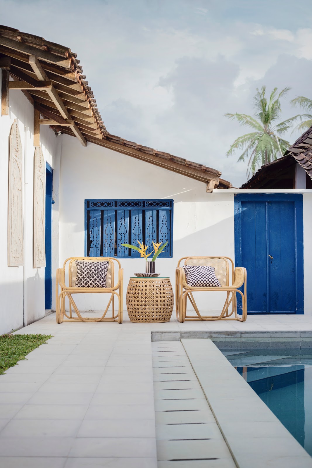 Take a look at this poolside retreat. The blue highlights on the door and windows act as an ideal representation of this year’s color of the
year. While I wouldn’t go so far as to emphasize the deep connection that this color causes with the… pool(?), you can feel the color’s tone here and we’ll happily leave those other conclusions to the members of Pantone’s secret color committee!
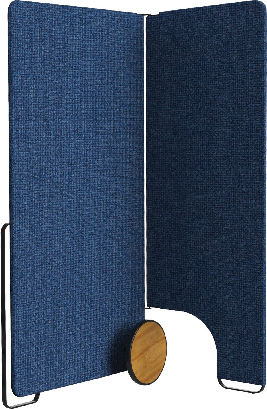
That being said, you really can feel something when you view this particular blue. We especially love limited use when deploying such a rich and deep color. Our own product, WALS, is actually available in a hue not far from classic blue. Using this portable acoustic barrier in your office could be the perfect jolt of life in an otherwise sterile environment.
We can assure you that we didn’t write this article with the intention of pitching our own products, but how could we pass up that opportunity? In all seriousness, Pantone’s Classic Blue will certainly be making more and more of an impact as the year goes on. Keep an eye on Pinterest, Facebook, LinkedIn, or anywhere else that fresh designs are posted.
See something you like? Share it with us here! We’d love to see the designs and layouts that are inspiring you this year. It doesn’t even have to include Classic Blue. Some people might disagree, but one of the benefits of declaring the color of the year, in our minds, is that it gives designers and industry experts a cleverly-laid path away from the mainstream.
We hope you have enjoyed this brief look at Pantone’s Color of the Year and we hope to see you again. We’ll be back son with fresh content! Have a great week and thanks for reading.